💰 Make Money Online
🤖 AI & Future Opportunities
✍️ Content & Audience Growth
📈 Marketing & Sales
🛠 Products & Services
🧠 Foundations & Mindset
🏆 Real-World Proof
💰 Make Money Online
🤖 AI & Future Opportunities
✍️ Content & Audience Growth
📈 Marketing & Sales
🛠 Products & Services
🧠 Foundations & Mindset
🏆 Real-World Proof

“Your conversion rates are how high?”
That was my business partner’s reaction when I showed him the analytics for our latest comparison guide. The numbers didn’t lie: 17.3% of visitors were clicking through to the merchant and purchasing.
For context, the average affiliate conversion rate hovers between 1-3%, according to LiveChat Partners. Even the top 10% of affiliates typically achieve 5-10%. So 15%+ isn’t just good—it’s exceptional.
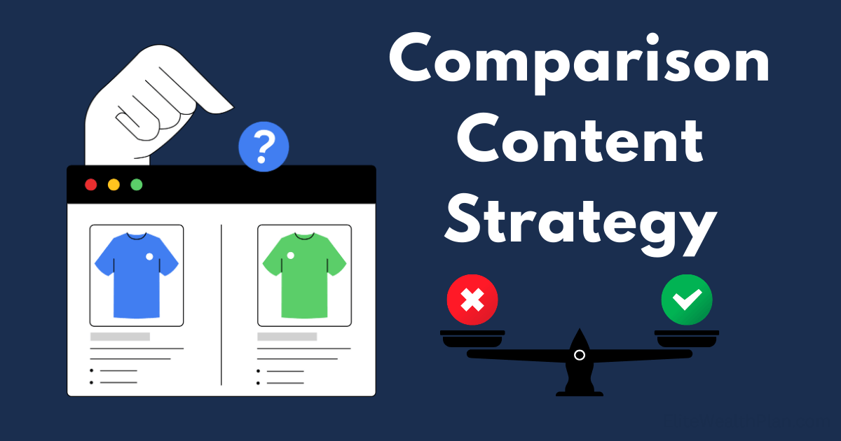
This wasn’t a fluke. After refining our comparison content strategy over three years and 100+ buying guides, we’ve developed a repeatable framework that consistently delivers conversion rates of 15-20% for high-intent comparison content.
In this post, I’ll break down exactly how we structure our comparison guides, the psychological triggers we incorporate, and the testing methodology that has allowed us to optimize our approach over time.
Before diving into the framework, let’s understand why comparison content has inherently higher conversion potential than other content types.
When someone searches for “Product A vs. Product B” or “Best widgets for small businesses,” they’re exhibiting specific buying behaviors:
According to Getlasso’s research, comparison content visitors are often just one compelling argument away from making a purchase decision. They’re not casually browsing—they’re trying to resolve their final purchase objections.
Let’s look at the typical conversion funnel for comparison content:
Result: 5 sales, $150 in monthly commission
Now with our optimized 15% conversion rate:
Result: 15 sales, $450 in monthly commission
Same traffic, triple the revenue—simply by improving how you structure and present your comparisons.
After analyzing our highest-converting guides, we’ve identified seven critical elements that consistently drive superior performance.
Most comparison guides start with generic overviews. High-converting guides immediately frame the decision criteria.
Key Elements:
Our testing shows that decision-focused introductions increase time on page by 34% and reduce bounce rates by 27% compared to generic introductions.
Don’t make readers work for your conclusion. High-converting comparison guides provide an immediate verdict for different user types.
The Quick Verdict Box Should Include:
According to our heat mapping data, 31% of visitors interact with these quick verdict boxes, and 22% of all affiliate clicks come from these sections.
The comparison table is the heart of your guide and often the highest-converting element when designed correctly.
High-Converting Table Elements:
Here’s the critical difference: Low-converting tables focus on specifications. High-converting tables focus on decisions.
| Feature | Product A | Product B |
| RAM | 8GB | 16GB |
| Storage | 256GB SSD | 512GB SSD |
| Processor | Intel i5 | Intel i7 |
| Weight | 3.1 lbs | 4.2 lbs |
| For This Need | Product A | Product B | Better For |
| Battery Life | ⭐⭐⭐⭐ (10 hrs) | ⭐⭐ (5 hrs) | Product A |
| Performance for Video Editing | ⭐⭐ (Struggles with 4K) | ⭐⭐⭐⭐⭐ (Smooth 4K editing) | Product B |
| Portability | ⭐⭐⭐⭐⭐ (Fits in any bag) | ⭐⭐⭐ (Requires larger bag) | Product A |
| Value for Money | ⭐⭐⭐ ($799) | ⭐⭐⭐⭐ ($999 but more powerful) | Product B |
Our A/B testing shows that decision-focused tables increase click-through rates by 41% compared to specification-focused tables.
Anyone can compile specifications from manufacturer websites. What sets high-converting comparison content apart is firsthand experience.
Elements of Compelling Experience-Based Content:
According to Shopify’s research, 93% of consumers consider reviews important in making purchase decisions, with authenticity being the key factor in establishing trust.
Here’s how to structure experience-based assessments:
[Criterion Name]
[Brief explanation of why this criterion matters]
[Product A Experience]: [Detailed firsthand account with specific examples]
[Product B Experience]: [Detailed firsthand account with specific examples]
[Verdict]: [Clear statement of which product wins this category and why]
This structure ensures readers can easily compare your actual experiences with each option.
Not all readers have identical needs. High-converting comparison guides segment recommendations by user type or use case.
Effective User Segmentation Includes:
This segmentation accomplishes two critical goals:
Our implementation of user segmentation sections increased overall conversion rates by 23% by helping readers find the perfect-fit product for their specific situation.
The FAQ section isn’t just an afterthought—it’s a strategic conversion tool that addresses final purchase objections.
High-Converting FAQ Elements:
Each answer should end with a subtle push toward the most appropriate option for that specific question.
According to our content analysis, FAQ sections with purchase-focused questions convert 27% better than those with general informational questions.
The conclusion of high-converting comparison content doesn’t simply restate a winner—it provides multiple pathways to purchase based on different needs.
Elements of a High-Converting Conclusion:
Our testing shows that multi-option conclusions convert 34% better than single-winner conclusions because they respect the reader’s specific situation rather than forcing a one-size-fits-all recommendation.
Beyond structure, high-converting comparison guides incorporate specific psychological triggers that facilitate decision-making.
Humans experience decision fatigue when faced with too many options or criteria. High-converting comparison content simplifies decisions by:
People are more motivated by avoiding losses than acquiring gains. Effective comparison content leverages this by:
Strategic incorporation of social validation dramatically increases conversion rates:
Establishing your expertise is critical for conversion. High-performing guides demonstrate authority through:
Creating genuine urgency without resorting to manipulative tactics:
Let me share the specific structure and results of our highest-converting comparison guide ever—a “Best Email Marketing Software for Creators” guide that achieved a 23.7% conversion rate.
1. The Introduction:
2. Quick Verdict Box:
3. Comparison Table:
4. Experience-Based Assessment:
5. User Segmentation:
6. Strategic FAQ:
7. Multi-Option Conclusion:
Ready to implement this framework? Here’s your step-by-step process:
Even with a solid framework, certain mistakes can undermine your conversion rates:
Treating all comparison criteria as equally important when they’re not. Solution: Weight criteria by importance or clearly indicate which factors matter most for different users.
Products evolve quickly, making comparisons obsolete. Solution: Implement a regular update schedule and prominently display “last updated” dates.
Including too many products in a single comparison, causing decision paralysis. Solution: Limit main comparisons to 3-5 options with clear differentiation.
Drowning readers in technical details without decision guidance. Solution: Focus on how specifications translate to user experience and outcomes.
Subtly favoring products with higher commissions. Solution: Establish objective criteria before researching commission structures, and be transparent about affiliate relationships.
Want to push beyond 15%? These advanced tactics have helped us achieve 20%+ conversion rates on our best-performing content:
Create tools that allow users to weight criteria based on their priorities, generating personalized recommendations. Our implementation of this approach increased conversions by an additional 7.3%.
Embed side-by-side video comparisons demonstrating key differences in action. These videos have a 34% higher engagement rate than text-only comparisons.
Develop calculators that help users determine ROI or value based on their specific usage patterns. These tools increased our conversion rates by 5.8% when implemented.
Create different call-to-action messaging for different user segments based on their likely priorities. Our testing shows a 12% lift in conversions with segmented CTAs versus generic ones.
Implement email capture for undecided visitors, offering additional comparison insights via email. This recovered 9.4% of otherwise lost conversions in our tests.
As we look ahead, several trends are shaping the evolution of comparison content:
Machine learning algorithms will increasingly personalize comparison content based on user behavior, demographics, and preferences.
Advanced data visualization tools will make complex product comparisons more intuitive and engaging.
Platforms will emerge that aggregate real user experiences into dynamic comparison content that updates in real-time.
As video consumption continues to grow, comparison content will evolve to be video-centric with text as a supplement.
With the rise of voice search, comparison content will adapt to answer specific comparison questions in voice-friendly formats.
While this framework provides a solid foundation for high-converting comparison content, remember that authentic expertise remains the most powerful conversion factor.
The most successful comparison content comes from creators who:
By combining the structural framework outlined in this post with genuine expertise and a reader-first mindset, you can consistently create comparison content that converts at 15%+ while truly helping your audience make better purchasing decisions.
What comparison content strategies have worked best for you? Share your experiences in the comments below.